new feature | mobile app • responsive web
Virtual Power Plant

This initiative served to expand EverBright’s reach into grid services and provide homeowners with the ability to participate in virtual power plant (VPP) events. Prior to this, our solar homeowners had no VPP capabilities.
my role
keystone species
This was one of those unicorn, once in a blue moon projects that are design led. With minimal product management involvement, I was able to own and create the vision based on our homeowners needs.
This meant I was the keystone species communicating between engineers handling the backend data pieces, business stakeholders determining the programs we enrolled in and marketing creating the consumer content and copy.
the objective
educate homeowners across the entire season
Virtual Power Plants are a complex concept to understand. Many of our homeowners are not familiar with how these work and as a result we needed to:
1. Educate users on what VPP is, specifically engaging them with the incentives.
2. Keep them informed on how their system is interacting with the grid both during and after events.


my process
iterating quickly
For this project it was imperative to iterate quickly in wireframes to get feedback from engineers on what was feasible based on our data availability. The key here was to create low fidelity mocks in figma and meet with engineers daily to get feedback because this feature was so dependent on the endpoints we had access to.
This meant I invested time upfront between steps 2 and 3, tweaking our ideal user journey based on our data:

Front loading work to ensure we had a solid low-fi flow saved us a lot of time down the line (ie. not getting attached to hi fidelity functionality we couldn’t support or having to add basic requirements down the road).
user journey
identifying 3 phases | mapping frontend to backend
I mapped out the ideal user journey based on primary user research we had conducted on solar homeowner expectations for VPP programs as well as a robust competitor analysis.
I then categorized the journey into 3 phases of a VPP season: Enrollment, the Event Level experience and the Event History:

Once I had the ideal user journey, I mapped these to frontend UI element requirements (what a user would see/interact with).
Then it was time to pull in the engineers- as mentioned before, it was an ongoing collaborative conversation. For example, one user desire we found through primary research was being able to see real-time information on how much money they were earning during an event, but because this data was not available until the end of the season, we landed on only displaying real-time energy data.
mobile hi fidelity
cheffing up the hi fi
The next step was to break up the Enrollment, Event Level and Event History phases into specific flows. I started with a mobile first approach as most of our homeowners would be driven to view the VPP tab in their mobile app through our push/SMS notifications.
Below is a birds eye of all of those mobile screens (happy path + error states) in light and dark mode.

graphics are key
An elegant and effective graphic language was key for something as complex as Virtual Power Plants. We needed establish trust with our homeowners who were new to this service by speaking in a language they could understand.
Graphics are universal, so I leveraged data visualizations and animations wherever possible to provide homeowners with an understanding of when and how their home was discharging energy to the grid.
event level
informing users on event status
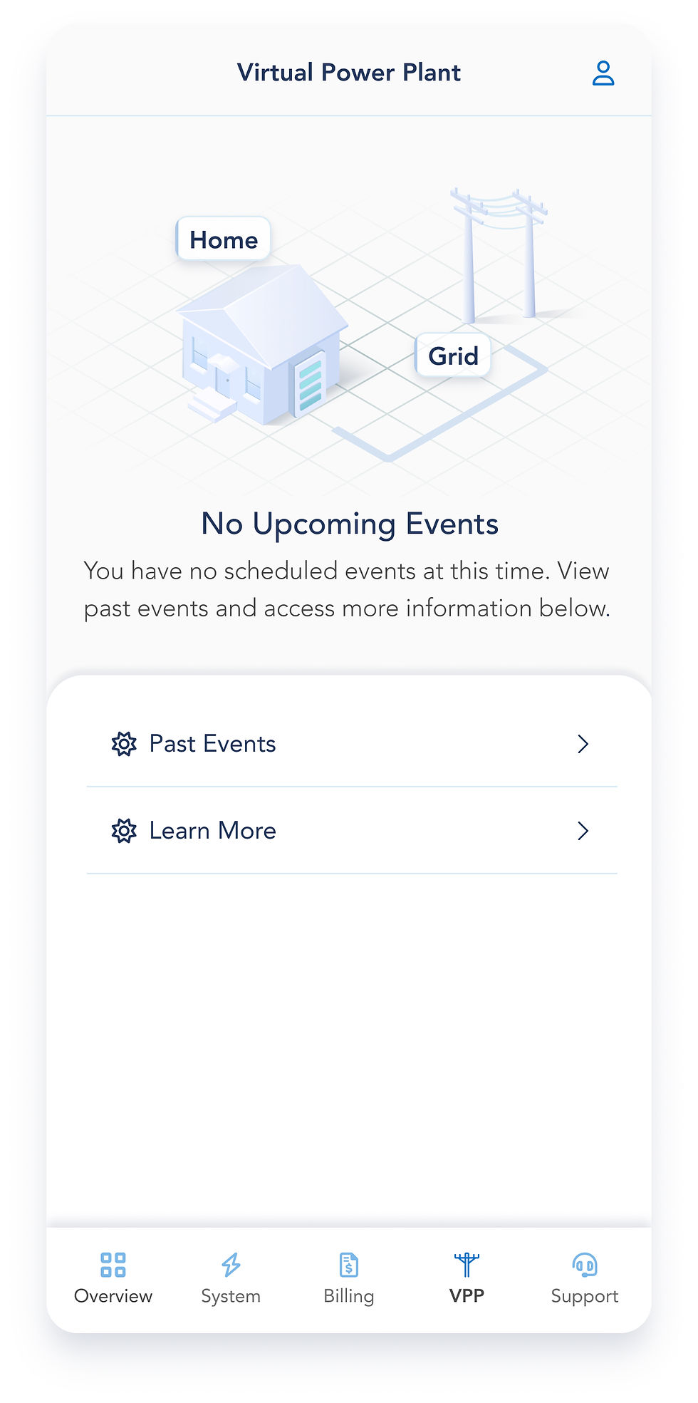
No Upcoming Events
Default view of VPP page as there is more often than not no scheduled events occurring.


Upcoming Event
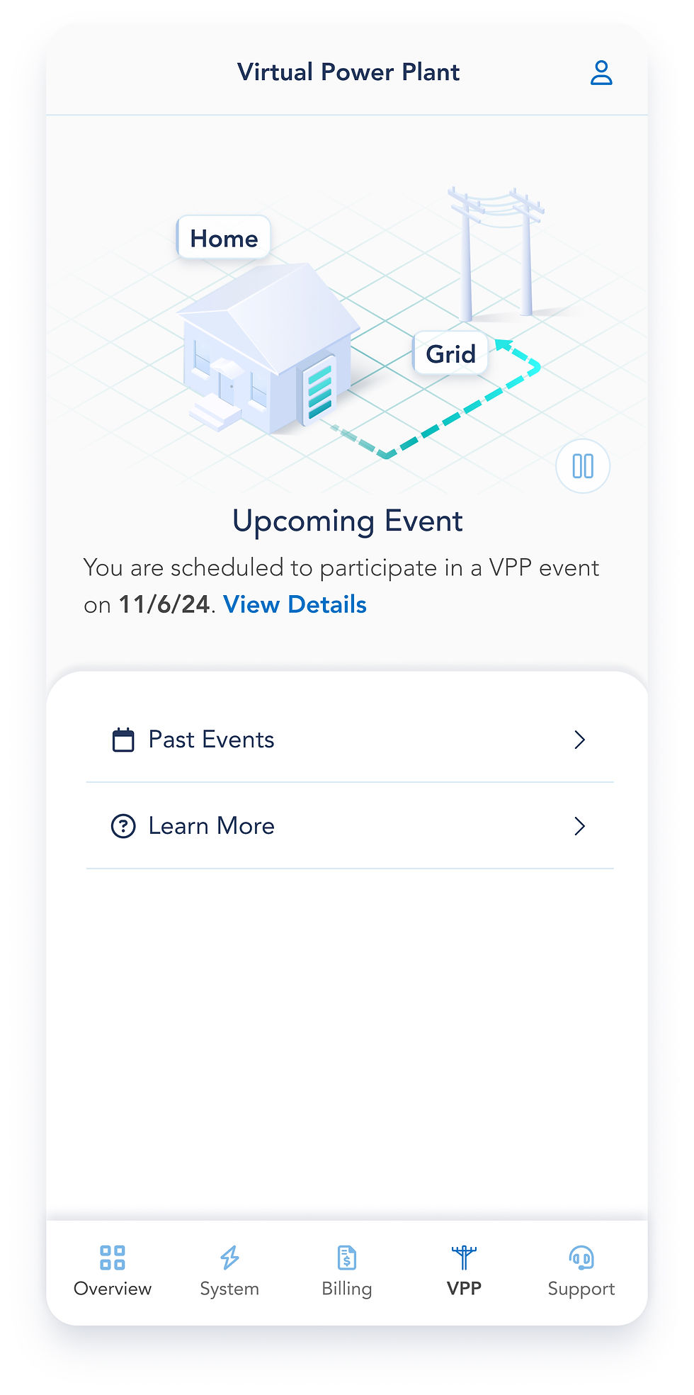
When there is an upcoming scheduled event, the status text and graphic changes (active blue dotted arrow). Users can see event details by clicking 'View Details.'
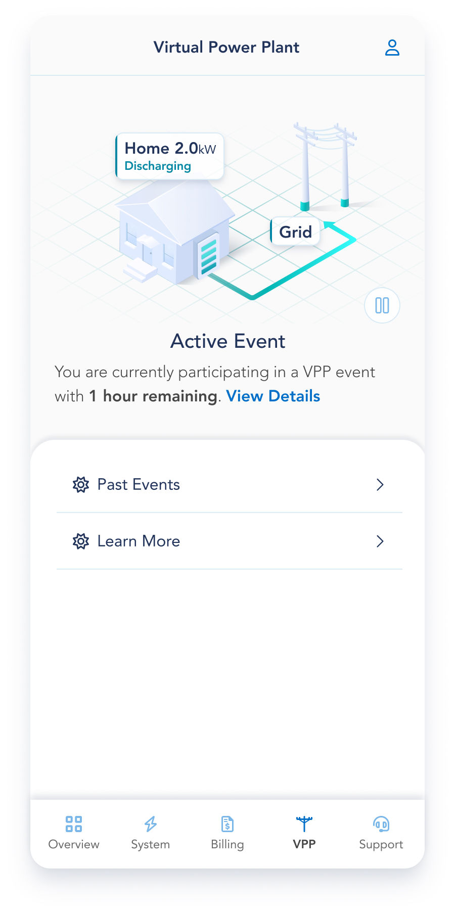

Active Event
Homeowners are notified when they are actively participating in a VPP event and the graphic updates. Tapping 'View Details' allows them to see their real-time energy discharge graph.
animations
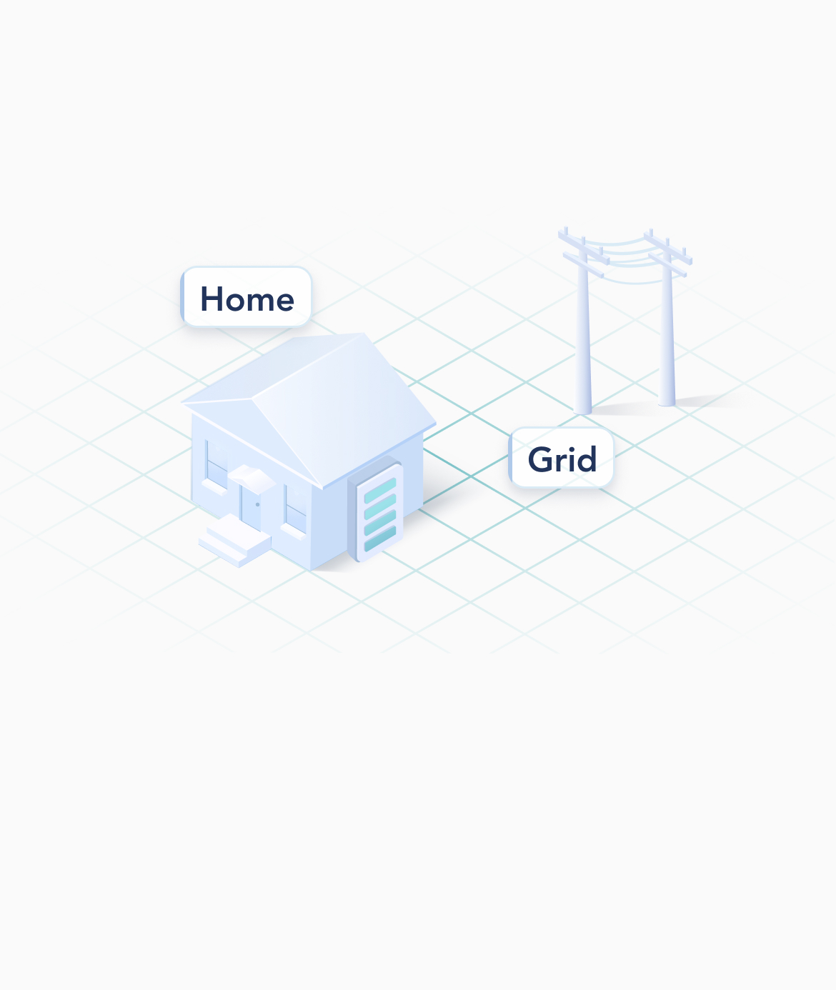

Upcoming Event
The arrow changes from grey to blue once there is a scheduled event and has a pulsing animation to indicate that activity is about to occur.
_gif.gif)
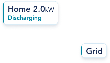
Active Event
The animated flow of energy from the battery to the grid indicates active energy discharge. The tag updates to clearly display that the home is discharging 2 kW.
event history
reviewing their event participation
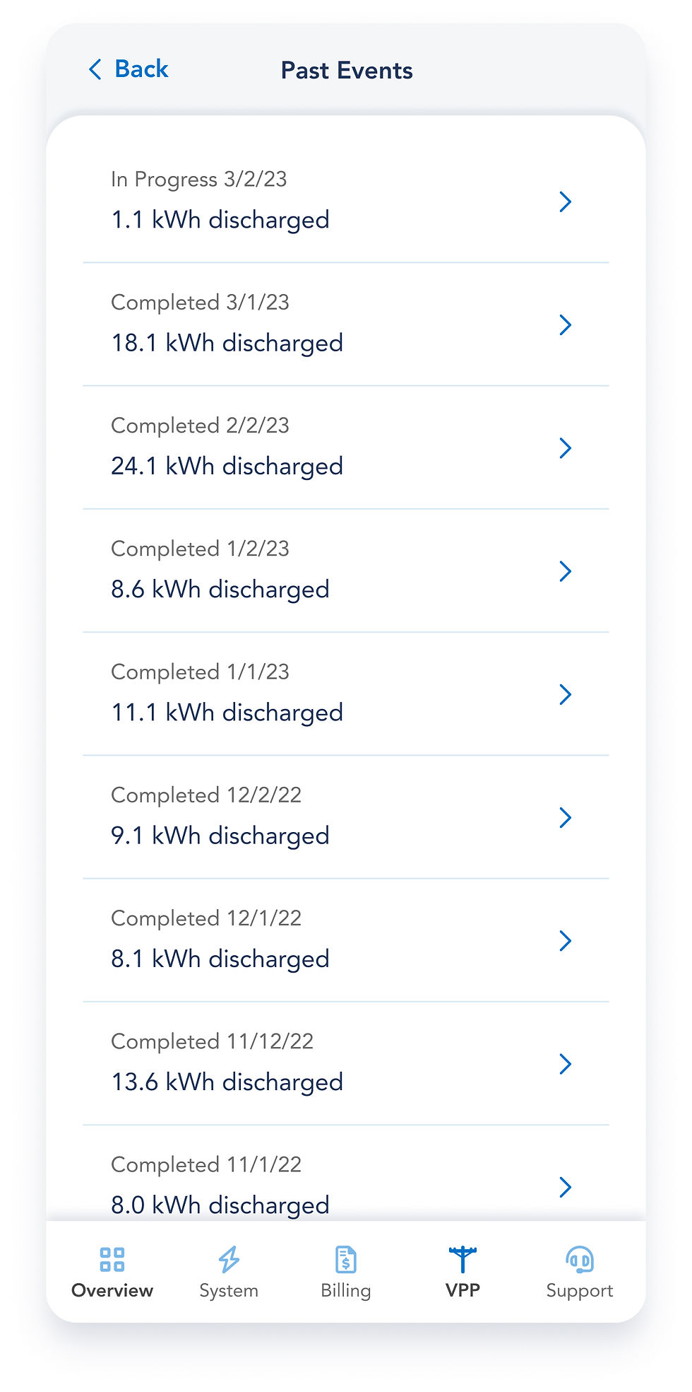

Completed Events
Users can view their past completed events at any time - selecting an event displays the total energy discharge graph.
web hi fi
translating to responsive web
The next step was to create the entire user journey for our web application. I did so for responsive screen sizes at desktop, tablet and mobile in light and dark modes.

This looks like a lot (and it was) creating all these screens was made much more efficient given that the entire user journey and low fidelity screens were set. All that work upfront in the design process paid off!
desktop, tablet, mobile
Here is an example of how the 'preparing for an event' state is displayed across devices on browser. This is in the hours leading up to an event when the home battery is charging in preparation to send energy to the grid.
desktop


tablet


mobile


learnings
how I grew
Design vision: Because I was straddling a product manager and design role, I was really able to lead the product strategy and vision for this feature. It was such a unique and humbling experience to not only learn how design is informed and constrained by requirements and timelines, but to manage that balance myself. As a designer every fiber of my being wants to provide the 'blue sky' vision, but this project taught me how to ship a real version.
Communication: I had to stay in close communication with partners across our business and marketing arms, as well as within our tech arm (engineers & designers) throughout the process. I also had to evangelize the finished result and explain the rationale for exactly why we landed on the experience we did.
UI breadth: This project was the largest design handoff I have done to date, from low fidelity screens being refined and re-refined to the finished product screens which encompassed both the native mobile app and the responsive web browser experience for both light and dark modes.